Eiri
and Shuichi
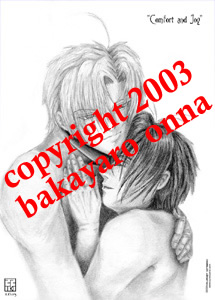
Comfort and Joy
please
close this window to return to the main page
| Imagine that! Yet another snuggle-type image! This is also another drawing directly from the head. The initial thumbnail sketch showed the final drawing was to have full bodies including legs, and the naked boys would be sitting down with limbs artfully draped for modesty. E would be sitting behind S and S would be leaning back on E while sitting on the floor created by the space made by E's legs who would have his knees open, one leg bent up and one leg parallel to the ground. The boys' heads would be close together. When I began the real sketch I realized I had made the bodies quite tiny and centered on a large piece of paper. While I liked the pose I had sketched out, I did not want to use that skeleton sketch because it was just too small to get any real detail out of it. I am always trying to get drawings as large as possible because most of my life I have made tiny art. So I decided to let that sketch stay in the notebook for future pose reference (because the sketch is actually good!) and I moved to another page. I began drawing much larger, completely changing the original poses to what you see here. Both boys' eyes were a bit of a challenge. E's was at an angle I really had not done before, well, not done well before. S's eye, as always, was a pain in the ass, so I drew a semi-generic side-view anime eye. I left out the irises on both sets of eyes so they would have more of the glassy-eyed contentedness look to them. For S's hand I referenced my own, which was interesting since I am left-handed. I had to look at my hand, then pick up the pencil and draw from memory. The title of this drawing comes from the time of the season - it was a little more than a month before Xmas and for some reason the words fit. |
|
|
|
|
|
This drawing sat on the hard drive for about two weeks before I decided to colour it in Photoshop. It is a pretty straight-forward airbrush colouring with the skintones and hair. I took S's hair to a darker colour here on purpose. I think it works better compositionally. The blue-to-clear colour gradient was added to jazz up the white background. It took a lot of time to clean around the edges of the drawing yet not lose the gradient colouring. At the time it was the only way I knew how to do this. I know other, easier techniques now. |
|

Close this window to return to menu
Everything on this site is the property of the denizens and inmates of Planet Witzend and Box O'Weekends Multimedia© except where otherwise indicated.
Please contact the webmaster for permission to use something prior to posting on your site or using in a project.
Gravitation is owned by Maki Murakami, Sony and Tokyo Pop. This is purely a fansite. We are not making any money off this in any way.
Copyright 2002-2006