please close this window to return to the main page
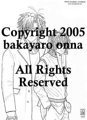 |
I was inspired to draw the boys in fashionable clothing and this drawing is the result. The photo used as a reference point for the boys is from an October 2003 Maxim magazine. The two fashion models were actually on opposite sides of the two-page photo spread. The model used for S had dreadlocks. S has an earring stud and E has both an earring stud and a loop in his ear. Are they real or are they just for the the photo shoot? The drawing was inked with Staedtler pigment liner pens, sizes 05, 01 and 005. E's eyes are extra-large yet again while S's head is too small. Oh well. Overall, the drawing came out okay. S's hair was done with a gradient with a few darker shadows added. E's hair shadows are made with web-safe greys and taken down to 64% opacity. Both guys' face shadows were drawn in using web-safe greys, blurred for smoothness, then opacity adjusted. Here is the breakdown on how I toned and textured the clothes: E's
clothes S's
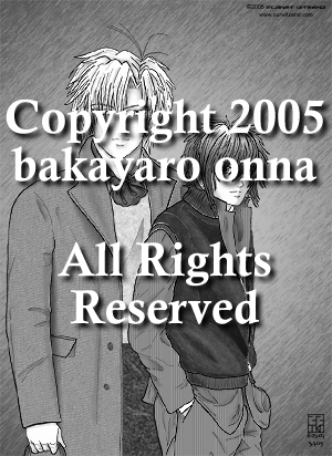
clothes Initially I tried a technique I think Ponderosa and PL Nunn use for their folds and it was taking a lot of time to do it since I had never done it before. I selected each fold with the lasso tool, then used a black-to-clear radial gradient to make the fold shadow. Then I took down the opacity so the texture underneath was seen but the shadow was still in place. It took a lot of time to do this so it looked right. I had done E's sweater fold, E's cravat folds, S's sleeveless jacket before I gave up on this pic and let it sit for eight months in the computer. Finally, I became inspired to complete this and decided to use a different technique for the rest of the folds. Using the paintbrush and various greys, I coloured in the folds, then used the blur tool to work up the original transparencies. Then the opacities of the fold layers were adjusted so the textures and patterns underneath came through. Any colour straying from the fold lines were erased to make a clean edge for each fold. I don't think this was completely successful so I will have to try it again later on another piece. The gradient background was added. I selected area outside the drawing with the magic wand tool, inversed the selection then deleted the selection inside the drawing. After that, I had to go around the edges of the drawing to clean up places missed by the delete. The gradient layer was copied and a filter was added to the new layer to get the lines texture. I was trying to make it look a little like a studio paper background. Since this piece looked like a magazine cover, I decided to make it look like an actual cover. So, it was off to research Japanese male fashion magazines on the web to see what I could find. Online research sources: J!-ENT:
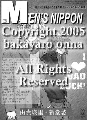
Fashion NOW!: http://www.nt2099.com/FASHION/ I looked at actual Japanese mens fashion magazine scans for ideas to make my faux magazine cover. I decided Men's Non-No was a good choice to use as a basis for the magazine graphics and text layout. It took a while to find fonts that had the same flavour as the magazine title. I had to make adjustments to the font character to get some of the width the way I wanted it on the large M. I ended up adding a narrow and hard-edge drop shadow to the magazine title to help lift it away from the graphic below. The Japanese text is taken from the April 2004 cover of Men's Non-No. The magazine page I found had bmp graphics of the cover contents for back issues. I cannot find the website where I got the graphic but I seem to recall it was a site with various magazine subscriptions and these pages were for back issue orders. When I first added the text to the graphic the Japanese was difficult to read and ran all the way across the bodies, so I decided to make a white box to emphasize the text like it is done sometimes on magazine covers. I stroked a dark grey line around the box edge then changed the opacity of the box so the figures could still be seen underneath. I had to shift the Japanese text around to get it to fit in the box. I am hoping I did not split up Japanese words too badly. I looked for katakana words and usually made the cut after one of those. Each part was cut up and adjusted separately in a new file, then that file was copy-merged and pasted into the main document. Space between each of the four Parts were eyeballed to about the same gap and the box was adjusted to fit around the final text section. Various single sentences of Japanese text were scattered around the faux cover for balance. Originally I had also called my magazine cover Men's Non-no, but I decided to avoid blatant copyright issues and change the second part to Nippon. Nippon is the patriotic word for Nihon, or Japan. The idea for the I HEART Bad Luck came from the June 2004 Men's Non-No cover, which states I HEART T-SHIRT. Originally I tried to distress the heart like the font I used but decided it did not look good and kept a pristine heart. I scanned in the boys' names from the Gravitation Fanbook 1 so I did not have to try and deal with finding the right kanji with the IME program. On the main graphic I selected the size I wanted the name graphic to be with the rectangle marque tool, made a new file with those dimensions and used that to build the name graphic. I copied each name from the original scan, pasted into the new file and re-scaled the name image until it fit into the new file size. I cobbled some of the background grey texture from the original scans with a combination of the copying bits of the grey and pasting it in areas needing it and blending with the clone tool so the two name graphics would look like they were on the same layer in the new file. I added the dot between the new names, then copy-merged the entire file and pasted it into the magazine file. Since I had left the marque tool selection on the magazine file active, when the name file pasted, it landed right where I wanted it to land. |
 |
|
Close this window to return to menu
Everything on this site is the property of the denizens and inmates of Planet Witzend and Box O'Weekends Multimedia© except where otherwise indicated.
Please contact the webmaster for permission to use something prior to posting on your site or using in a project.
Gravitation is owned by Maki Murakami, Sony and Tokyo Pop. This is purely a fansite. We are not making any money off this in any way.
Copyright 2002-2006